Discussion - Member to Member Sales - Research Center
Discussion - Member to Member Sales - Research Center
Does anyone use one of these, or something similar?

If you do, it would interesting to know what your experience has been.
Have you found these colour keys to be useful? Have you perhaps only found these useful for more modern material, or for certain types of printing?
What has been your experience of trying to identify very early classics. If you have had success, which country/issue? If not, what was the difficulty?
I there anybody who, having used different makes, has found more success with one over the other?
Or do you find these as much use as teats on a boar?

Login to Like
this post
The best color comparisons to use are actual stamps with the same catalog-stated color from the same general time period and printing method.
No color chart that I have ever seen/used (I tried two, including the Gibbons key), was worth a crud.
Login to Like
this post

07:51:05am
Here is an excellent discussion on colors posted on the discussion board not so long ago. http://stamporama.com/discboard/disc_main.php?action=20&id=6620#40993
Login to Like
this post
Now that was the thread that I was looking for. I had read it but somehow missed it again.
There are some very interesting and valid points about compiling ones own colour reference, using actual stamps. That is perfect for those that can obtain copies easily and cheaply.
What about the collector who can't do that, either because of the sparcity or expense of such material. What about the new or inexperienced collector? Perhaps they obtained a colour key because they were advised to do so; and I have seen that advice given many times. How have they fared?
I partly raised this subject (again) having recently seen something listed on eBay, where the seller actually used one of the colour swatches on the SG stamp colour key, in an image with the stamp being listed:

Ordinarily, I would commend this approach but in this instance it is actually wrong; the stamp shown is not the 'rose pink' of the swatch. This one image demonstrates to me the difficulties that many I'm sure have on difficult shade issues.
What might the inexperienced collector do in this instance? Because of lack of experience and doubts over catalogue descriptions, they might be persuaded to trust the sellers confidence in showing this.
This also illustrates my point of many collectors not being able to build their own reference of shade samples. The 'rose-pink' shade is listed at £250 mint in SG and the stamp shown is £50. As the former is £32 used, there is no cheap way of building shade samples.
I know from my own experience of this issue, that the used copies change in colour on the scarcer shades. So shade sampling is not always foolproof.
Back to the stamp colour key. I wonder how many collectors bought one of these without realising that Gibbons actually states within the front notes:
"Classic stamps and rare shades of early issues are universally known by a particular colour name which has become established over years. This Colour Key is not intended to match these rarities, nor will they be renamed."
A bit difficult to see this when the beast is wrapped in cellophane.
Login to Like
this post
11:08:18am
Added to the problem is the fact that different catalogs will identify the same stamp by different color names. I cannot even tell the difference between blue and ultramarine, let alone between carmine-rose and rose-carmine (yes, according to many sources, these are two distinctly different colors). I am pretty good at noticing the difference between red and blue, and yellow and pink, but when they get into some of the more esoteric names, forget it.
3 Members
like this post.
Login to Like.
This is another example of one of the advantages of attending stamp shows. I always poke around for old remaindered albums being sold off cheap. There are almost always one or two stamps left in these old, battered, unloved albums to make their purchase worthwhile. If not they can certainly be used for color ID, etc.
These 3 examples are from an old Henri Thiaude album I picked up at a show. The condition is generally lousy, but there were a lot of old French colonies stamps that made it worthwhile. Note the color varieties. I know they are used stamps and some are faded,etc. but they serve as useful reference material and at a cost of a few cents a stamp you just can't get reference material any cheaper.


Login to Like
this post
A local dealer has two "cards" put out by Gibbons long ago for identifying early US stamps. They both had actual stamps from the issues to see and feel. One was a color guide for the reds, and one was a paper type for the bank notes. Similar to this image.
Login to Like
this post
Oh if only these 'sample' type pages had been available for my collection. The only thing I've seen closely resembling these, is the odd page of seriously washed out examples, purporting to be shades.
Login to Like
this post
I bought the Scott color key for 19th Century stamps but my eyes aren't calibrated for color. I gave up. I don't collect subtle color differences.
I recognize 10 "colors":
Red, blue, yellow, purple, orange, green, brown, gray, black, and white. I also support federal legislation to specify a standard off-white ceiling color. You can paint your ceiling any color you want, but if it's going to be off-white, it HAS to be the specified color. It's so annoying to do a ceiling repair and then have to figure whether the ceiling is light taupe or eggshell or any of a dozen other silly names. Let's just define one Pantone CMYK combination and call it "ceiling". Is that asking too much?
Lars
2 Members
like this post.
Login to Like.
I have one of these SG Stamp Colour Keys. I purchased it from a guy who didn't like it so I got it real cheep. Now I don't like it.
Login to Like
this post
"I also support federal legislation to specify a standard off-white ceiling color."
 Here, here!!
-Steve
Login to Like
this post
I bet there is a way to use the nifty new USB Microscope to compare the colors of a stamp to a color chart without having to guess.
Login to Like
this post
Some time ago I managed to buy the following colour guide; a forerunner to the Stanley Gibbons Stamp Colour Key. This one dates I think from the 1930's.
This is a little gem, as it gives an insight into SG's attitude to the collector at that time.
They commissioned Perkins Bacon & Co Ltd, to produce a series of 100 labels, using the same printing, gumming and perforation process used for the production of actual postage stamps. Gibbons chose the samples to be re-produced.
The 'colour chart', which folds out, has a very useful explanation of catalogue colour descriptions.
In this post, I've shown the cover and part of the labels. The image quality is not great, as I photographed the guide before I owned a scanner. Unfortunately I have mislaid the guide, otherwise I would have actually scanned the labels:
Colour guide front:

Sample labels:

1 Member
likes this post.
Login to Like.
First page of the explanation:

Login to Like
this post
Second page of the explanation:

Login to Like
this post
Hi All
I do not use a color key, but understand it could be helpful.
Right off the bat, I can think of one area where the color key might put a stamp collector wrong. As far as trying to determine the color for identification of U. S. A. stamp number 500. There are number 499's the exact same color. Now there are many of these 499's the same color as 500's. You'd have to do a lot more identification to be sure whether or not is a real number 500. I've found about a dozen number 500's.
If anybody is interested I could post my ways of identification of U. S. A. 500.
Let me know.
DAVID THOMPSON
MSGT/USAF/RETIRED
Login to Like
this post
I would be very interested David, as well as any other tips for difficult areas of early US.
Login to Like
this post
Seanpashby
OK Sir.
But I will mostly confine myself with just number 500. I'm not as experienced in other areas of regular postage stamps, just to say I started out studying W/F heads early on, then worked for two stamp stores in just identifying the W/F stamps for them. This was also a good way to pick up plate varieties on the W/F heads.
OK, lets start.
500 is a flat plate printed stamp (very important to remember this). A lot and I mean a lot of stamp collectors mistake the offset stamps for number 500.
The best way to check if a stamp is offset is close your eyes, run your finger nail across it. Remember that feeling. Then run your finger nail across any flat press printed stamp (keep those eyes closed). After doing this you should know the difference right away.
So now you have a flat press printed stamp, of the right design. Examine the reverse side very carefully. At least 99% of all flat press printed stamps will have some degree of ink on the reverse. This step really not necessary, but thought I'd just throw it in anyway.
500 is nothing more than a 499 but the transfer roll was applied using twice the pressure!
Ten designs were laid down instead of one design on the transfer roll. This was an experiment to decrease the production time of plate making.
The standard way is advised by most catalogs is to examine the toga button. True enough this is a good starting point, but also examine the toga connecting rope, they should be full. Also check out the leaves, the lines inside the leaves should be deeper and thicker, outstanding really! The shading around the head area is much darker with much less white!
Now then you have it.
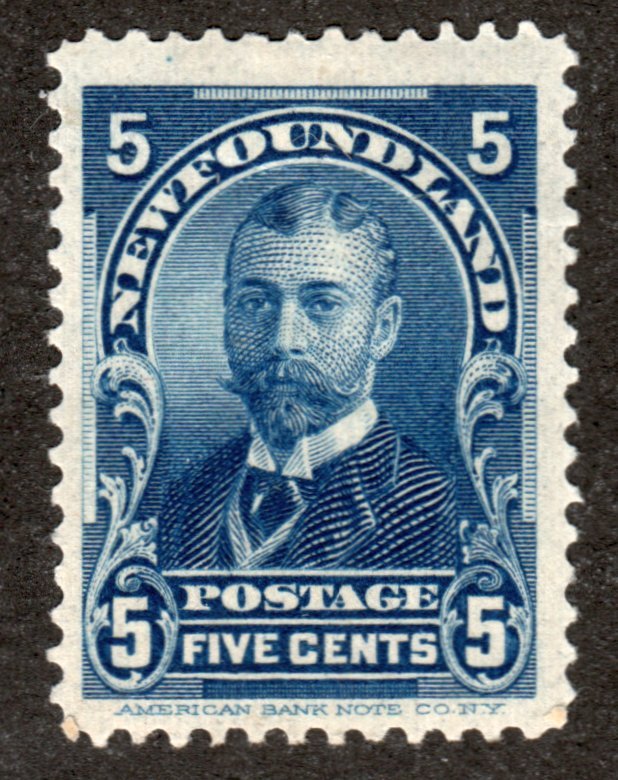
One thing to keep in mind, on plate 10208 from the lower left pane position 95 the ten design transfer roll required a reentry. To avoid have 9 or 10 double transfers, a single design transfer roll 499 was transferred into that position. So you end up with a lower left pane of 500 with one 499 all in the color of 500.

The above image is 500, 528, 499.
I forgot to mention it, but offset stamps do not have any printing ink on the reverse!
This number 500 was found when I worked in a stamp shop identifying all his W/F heads for him. Because it had a straight edge he just gave it to me. I have no problem with straight edge stamps!
DAVID THOMPSON
MSGT/USAF/RETIRED
1 Member
likes this post.
Login to Like.
Hi Everyone;
God, how I wish I had your gift for attention to detail, and incredible memory. I'm a complete
loss for trying to identify those W/Fs. I think I could probably reliably identify maybe 5-10%
of them. But they are a fun challenge aren't they?
Just tripin' out in Tatooine....
TuskenRaider
Login to Like
this post
TuskenRaider
If you worked on W/F as long as I did, you would find out it becomes second nature.
There is no gift here, just many and more many and then hundreds more hours of working with W/F's.
When I started there wasn't any guides around, so I made my own, and kept at it.
Yes, W/F heads are fun, until you get a head ache, then I'd have to stop.
Good luck.
DAVID THOMPSON
MSGT/USAF/RETIRED
1 Member
likes this post.
Login to Like.
Thanks David. That helps a lot. If you could make identifying Bank note paper types that easy, life would be a lot simpler.
Login to Like
this post
Seanpashby
Glad you enjoyed it.
I also wish I knew more about identifying Bank note paper types, I have a few ideas, and have made some tests, but lost interest too soon, never amounted to very much.
DAVID THOMPSON
MSGT/USAF/RETIRED
1 Member
likes this post.
Login to Like.
I learned quickly that some folks are unable to discern color shades, literally unable to discern the differences in color shades because of ocular differences in their eyeballs--at least that is my unscientific explanation for the issue.
Having said that, I seem to have a pretty good shade differential built into my eyeballs and use the Michel Color book for my German stamps. Still, while informative it is daunting and fraught with peril, if you will excuse the cliche, to undertake accurate shade identification.
There are, as many here likely know, many shades listed for otherwise common stamps whose prices can take one's breath away. These prices can be insane on both ends of the spectrum and I wonder how often my own eyes cheat a little when comparing a stamp to color guide, finding gold where there is only dross?
Bruce
Login to Like
this post
At least they are not white and gold
We would not want to confuse them with blue and black stamps
Would we 
1 Member
likes this post.
Login to Like.
Ha!
Bruce
Login to Like
this post
SG key is derived from pantone system ... 200 shades
combine the panels in your scans, then use colorpix to compare in hexadecimal...
http://www.colorschemer.com/colorpix_info.php
(Modified by Moderator on 2015-03-01 21:00:07)
Login to Like
this post

No, the colour comparisons do not seem correct when applying the key to stamps.
Login to Like
this post
Color guides designed to identify particular issues can be useful. For example, the "Scott Specialized Color Guides for U.S. Stamps", which is good for only identifying 4 major issues and their color varieties.

Lars, is this the "Scott color key for 19th Century stamps" that you referred? When I searched years ago for a color guide all I found was the above.
More useful, but way more expensive is the "Encyclopedia of the colors of United States postage stamps". This is out of print but on occasion a copy can be found for less than $500 and the Library of Congress has a copy.
I have a couple of the very general color guides, the Michel and the G&K Wonder Guide. I use the Michel guide occasionally when I don't have a better reference just to get an idea of what the difference in shades might be.
Not sure if anyone has mentioned this, but a good source for color ids would be searching for certificates of expertization from expertising. For example, The Philatelic Foundation allows a search of their certificates from their home page.
http://www.philatelicfoundation.org/
The problem with online sources is the potential difference in color due to your computer's video display and the devices used to create the images. Nothing beats having real examples in hand for comparison.
Login to Like
this post
I collect British Commonwealth and Colonies. As such, my primary reference is Stanley Gibbons. SG markets a color key that, in my view, works quite well. With a few exceptions I have always found that the name of a stamp’s color, per the guide, matches the name listed in the SG catalog.
As for relying on an on-line color verification, I agree that colors can vary from monitor to monitor and as such are unreliable.
Login to Like
this post
Agree that on-line color guides are generally not completely reliable. However, there are two exceptions I've found in which they are useful:
1. To just get in the general ballpark. Years ago, when my color palate was defined by the Crayola Crayon Company, I would have liked to have an on-line source to tell me what "vermilion" was.
2. To make comparisons in a relative sense. When someone posts a picture of several stamps, and says, "See how the one on the left is a shade lighter? That is the 123a variety, while the one on the right is the more common 123." In most of those cases, I have enough to go on at that point. I can't use it in an absolute sense as a matching guide, but it does help me understand the magnitude of the nuance I am looking for.
-Steve
Login to Like
this post

Although this topic has probably been discussed before, it would be interesting to bring this up to date.
Does anyone use one of these, or something similar?
If you do, it would interesting to know what your experience has been.
Have you found these colour keys to be useful? Have you perhaps only found these useful for more modern material, or for certain types of printing?
What has been your experience of trying to identify very early classics. If you have had success, which country/issue? If not, what was the difficulty?
I there anybody who, having used different makes, has found more success with one over the other?
Or do you find these as much use as teats on a boar?
Login to Like
this post

re: Do you use a stamp colour key?
The best color comparisons to use are actual stamps with the same catalog-stated color from the same general time period and printing method.
No color chart that I have ever seen/used (I tried two, including the Gibbons key), was worth a crud.
Login to Like
this post
They who would give up essential Liberty, to purchase a little temporary Safety, deserve neither Liberty nor Safety. -Benjamin Franklin
27 Feb 2015
07:51:05am
re: Do you use a stamp colour key?
Here is an excellent discussion on colors posted on the discussion board not so long ago. http://stamporama.com/discboard/disc_main.php?action=20&id=6620#40993
Login to Like
this post
re: Do you use a stamp colour key?
Now that was the thread that I was looking for. I had read it but somehow missed it again.
There are some very interesting and valid points about compiling ones own colour reference, using actual stamps. That is perfect for those that can obtain copies easily and cheaply.
What about the collector who can't do that, either because of the sparcity or expense of such material. What about the new or inexperienced collector? Perhaps they obtained a colour key because they were advised to do so; and I have seen that advice given many times. How have they fared?
I partly raised this subject (again) having recently seen something listed on eBay, where the seller actually used one of the colour swatches on the SG stamp colour key, in an image with the stamp being listed:
Ordinarily, I would commend this approach but in this instance it is actually wrong; the stamp shown is not the 'rose pink' of the swatch. This one image demonstrates to me the difficulties that many I'm sure have on difficult shade issues.
What might the inexperienced collector do in this instance? Because of lack of experience and doubts over catalogue descriptions, they might be persuaded to trust the sellers confidence in showing this.
This also illustrates my point of many collectors not being able to build their own reference of shade samples. The 'rose-pink' shade is listed at £250 mint in SG and the stamp shown is £50. As the former is £32 used, there is no cheap way of building shade samples.
I know from my own experience of this issue, that the used copies change in colour on the scarcer shades. So shade sampling is not always foolproof.
Back to the stamp colour key. I wonder how many collectors bought one of these without realising that Gibbons actually states within the front notes:
"Classic stamps and rare shades of early issues are universally known by a particular colour name which has become established over years. This Colour Key is not intended to match these rarities, nor will they be renamed."
A bit difficult to see this when the beast is wrapped in cellophane.
Login to Like
this post
They who would give up essential Liberty, to purchase a little temporary Safety, deserve neither Liberty nor Safety. -Benjamin Franklin
27 Feb 2015
11:08:18am
re: Do you use a stamp colour key?
Added to the problem is the fact that different catalogs will identify the same stamp by different color names. I cannot even tell the difference between blue and ultramarine, let alone between carmine-rose and rose-carmine (yes, according to many sources, these are two distinctly different colors). I am pretty good at noticing the difference between red and blue, and yellow and pink, but when they get into some of the more esoteric names, forget it.
3 Members
like this post.
Login to Like.

re: Do you use a stamp colour key?
This is another example of one of the advantages of attending stamp shows. I always poke around for old remaindered albums being sold off cheap. There are almost always one or two stamps left in these old, battered, unloved albums to make their purchase worthwhile. If not they can certainly be used for color ID, etc.
These 3 examples are from an old Henri Thiaude album I picked up at a show. The condition is generally lousy, but there were a lot of old French colonies stamps that made it worthwhile. Note the color varieties. I know they are used stamps and some are faded,etc. but they serve as useful reference material and at a cost of a few cents a stamp you just can't get reference material any cheaper.
Login to Like
this post

re: Do you use a stamp colour key?
A local dealer has two "cards" put out by Gibbons long ago for identifying early US stamps. They both had actual stamps from the issues to see and feel. One was a color guide for the reds, and one was a paper type for the bank notes. Similar to this image.
Login to Like
this post
re: Do you use a stamp colour key?
Oh if only these 'sample' type pages had been available for my collection. The only thing I've seen closely resembling these, is the odd page of seriously washed out examples, purporting to be shades.
Login to Like
this post

re: Do you use a stamp colour key?
I bought the Scott color key for 19th Century stamps but my eyes aren't calibrated for color. I gave up. I don't collect subtle color differences.
I recognize 10 "colors":
Red, blue, yellow, purple, orange, green, brown, gray, black, and white. I also support federal legislation to specify a standard off-white ceiling color. You can paint your ceiling any color you want, but if it's going to be off-white, it HAS to be the specified color. It's so annoying to do a ceiling repair and then have to figure whether the ceiling is light taupe or eggshell or any of a dozen other silly names. Let's just define one Pantone CMYK combination and call it "ceiling". Is that asking too much?
Lars
2 Members
like this post.
Login to Like.

re: Do you use a stamp colour key?
I have one of these SG Stamp Colour Keys. I purchased it from a guy who didn't like it so I got it real cheep. Now I don't like it.
Login to Like
this post

re: Do you use a stamp colour key?
"I also support federal legislation to specify a standard off-white ceiling color."
Here, here!! -Steve
Login to Like
this post
re: Do you use a stamp colour key?
I bet there is a way to use the nifty new USB Microscope to compare the colors of a stamp to a color chart without having to guess.
Login to Like
this post
re: Do you use a stamp colour key?
Some time ago I managed to buy the following colour guide; a forerunner to the Stanley Gibbons Stamp Colour Key. This one dates I think from the 1930's.
This is a little gem, as it gives an insight into SG's attitude to the collector at that time.
They commissioned Perkins Bacon & Co Ltd, to produce a series of 100 labels, using the same printing, gumming and perforation process used for the production of actual postage stamps. Gibbons chose the samples to be re-produced.
The 'colour chart', which folds out, has a very useful explanation of catalogue colour descriptions.
In this post, I've shown the cover and part of the labels. The image quality is not great, as I photographed the guide before I owned a scanner. Unfortunately I have mislaid the guide, otherwise I would have actually scanned the labels:
Colour guide front:
Sample labels:
1 Member
likes this post.
Login to Like.
re: Do you use a stamp colour key?
First page of the explanation:
Login to Like
this post
re: Do you use a stamp colour key?
Second page of the explanation:
Login to Like
this post
04:16:34pm
re: Do you use a stamp colour key?
Hi All
I do not use a color key, but understand it could be helpful.
Right off the bat, I can think of one area where the color key might put a stamp collector wrong. As far as trying to determine the color for identification of U. S. A. stamp number 500. There are number 499's the exact same color. Now there are many of these 499's the same color as 500's. You'd have to do a lot more identification to be sure whether or not is a real number 500. I've found about a dozen number 500's.
If anybody is interested I could post my ways of identification of U. S. A. 500.
Let me know.
DAVID THOMPSON
MSGT/USAF/RETIRED
Login to Like
this post
re: Do you use a stamp colour key?
I would be very interested David, as well as any other tips for difficult areas of early US.
Login to Like
this post
11:52:14pm
re: Do you use a stamp colour key?
Seanpashby
OK Sir.
But I will mostly confine myself with just number 500. I'm not as experienced in other areas of regular postage stamps, just to say I started out studying W/F heads early on, then worked for two stamp stores in just identifying the W/F stamps for them. This was also a good way to pick up plate varieties on the W/F heads.
OK, lets start.
500 is a flat plate printed stamp (very important to remember this). A lot and I mean a lot of stamp collectors mistake the offset stamps for number 500.
The best way to check if a stamp is offset is close your eyes, run your finger nail across it. Remember that feeling. Then run your finger nail across any flat press printed stamp (keep those eyes closed). After doing this you should know the difference right away.
So now you have a flat press printed stamp, of the right design. Examine the reverse side very carefully. At least 99% of all flat press printed stamps will have some degree of ink on the reverse. This step really not necessary, but thought I'd just throw it in anyway.
500 is nothing more than a 499 but the transfer roll was applied using twice the pressure!
Ten designs were laid down instead of one design on the transfer roll. This was an experiment to decrease the production time of plate making.
The standard way is advised by most catalogs is to examine the toga button. True enough this is a good starting point, but also examine the toga connecting rope, they should be full. Also check out the leaves, the lines inside the leaves should be deeper and thicker, outstanding really! The shading around the head area is much darker with much less white!
Now then you have it.
One thing to keep in mind, on plate 10208 from the lower left pane position 95 the ten design transfer roll required a reentry. To avoid have 9 or 10 double transfers, a single design transfer roll 499 was transferred into that position. So you end up with a lower left pane of 500 with one 499 all in the color of 500.
The above image is 500, 528, 499.
I forgot to mention it, but offset stamps do not have any printing ink on the reverse!
This number 500 was found when I worked in a stamp shop identifying all his W/F heads for him. Because it had a straight edge he just gave it to me. I have no problem with straight edge stamps!
DAVID THOMPSON
MSGT/USAF/RETIRED
1 Member
likes this post.
Login to Like.

re: Do you use a stamp colour key?
Hi Everyone;
God, how I wish I had your gift for attention to detail, and incredible memory. I'm a complete
loss for trying to identify those W/Fs. I think I could probably reliably identify maybe 5-10%
of them. But they are a fun challenge aren't they?
Just tripin' out in Tatooine....
TuskenRaider
Login to Like
this post
01:29:01am
re: Do you use a stamp colour key?
TuskenRaider
If you worked on W/F as long as I did, you would find out it becomes second nature.
There is no gift here, just many and more many and then hundreds more hours of working with W/F's.
When I started there wasn't any guides around, so I made my own, and kept at it.
Yes, W/F heads are fun, until you get a head ache, then I'd have to stop.
Good luck.
DAVID THOMPSON
MSGT/USAF/RETIRED
1 Member
likes this post.
Login to Like.
re: Do you use a stamp colour key?
Thanks David. That helps a lot. If you could make identifying Bank note paper types that easy, life would be a lot simpler.
Login to Like
this post
12:07:10pm
re: Do you use a stamp colour key?
Seanpashby
Glad you enjoyed it.
I also wish I knew more about identifying Bank note paper types, I have a few ideas, and have made some tests, but lost interest too soon, never amounted to very much.
DAVID THOMPSON
MSGT/USAF/RETIRED
1 Member
likes this post.
Login to Like.
12:25:47pm
re: Do you use a stamp colour key?
I learned quickly that some folks are unable to discern color shades, literally unable to discern the differences in color shades because of ocular differences in their eyeballs--at least that is my unscientific explanation for the issue.
Having said that, I seem to have a pretty good shade differential built into my eyeballs and use the Michel Color book for my German stamps. Still, while informative it is daunting and fraught with peril, if you will excuse the cliche, to undertake accurate shade identification.
There are, as many here likely know, many shades listed for otherwise common stamps whose prices can take one's breath away. These prices can be insane on both ends of the spectrum and I wonder how often my own eyes cheat a little when comparing a stamp to color guide, finding gold where there is only dross?
Bruce
Login to Like
this post

re: Do you use a stamp colour key?
At least they are not white and gold
We would not want to confuse them with blue and black stamps
Would we
1 Member
likes this post.
Login to Like.

re: Do you use a stamp colour key?
SG key is derived from pantone system ... 200 shades
combine the panels in your scans, then use colorpix to compare in hexadecimal...
http://www.colorschemer.com/colorpix_info.php
(Modified by Moderator on 2015-03-01 21:00:07)
Login to Like
this post
Member ACCC (Australian Commonwealth Collectors Club of NSW)
08 Jun 2015
08:43:38am
re: Do you use a stamp colour key?
No, the colour comparisons do not seem correct when applying the key to stamps.
Login to Like
this post

re: Do you use a stamp colour key?
Color guides designed to identify particular issues can be useful. For example, the "Scott Specialized Color Guides for U.S. Stamps", which is good for only identifying 4 major issues and their color varieties.
Lars, is this the "Scott color key for 19th Century stamps" that you referred? When I searched years ago for a color guide all I found was the above.
More useful, but way more expensive is the "Encyclopedia of the colors of United States postage stamps". This is out of print but on occasion a copy can be found for less than $500 and the Library of Congress has a copy.
I have a couple of the very general color guides, the Michel and the G&K Wonder Guide. I use the Michel guide occasionally when I don't have a better reference just to get an idea of what the difference in shades might be.
Not sure if anyone has mentioned this, but a good source for color ids would be searching for certificates of expertization from expertising. For example, The Philatelic Foundation allows a search of their certificates from their home page.
http://www.philatelicfoundation.org/
The problem with online sources is the potential difference in color due to your computer's video display and the devices used to create the images. Nothing beats having real examples in hand for comparison.
Login to Like
this post

re: Do you use a stamp colour key?
I collect British Commonwealth and Colonies. As such, my primary reference is Stanley Gibbons. SG markets a color key that, in my view, works quite well. With a few exceptions I have always found that the name of a stamp’s color, per the guide, matches the name listed in the SG catalog.
As for relying on an on-line color verification, I agree that colors can vary from monitor to monitor and as such are unreliable.
Login to Like
this post
re: Do you use a stamp colour key?
Agree that on-line color guides are generally not completely reliable. However, there are two exceptions I've found in which they are useful:
1. To just get in the general ballpark. Years ago, when my color palate was defined by the Crayola Crayon Company, I would have liked to have an on-line source to tell me what "vermilion" was.
2. To make comparisons in a relative sense. When someone posts a picture of several stamps, and says, "See how the one on the left is a shade lighter? That is the 123a variety, while the one on the right is the more common 123." In most of those cases, I have enough to go on at that point. I can't use it in an absolute sense as a matching guide, but it does help me understand the magnitude of the nuance I am looking for.
-Steve
Login to Like
this post