Discussion - Member to Member Sales - Research Center
Discussion - Member to Member Sales - Research Center
I'd like to examine this further, and ask SOR members' views on where they stand on the 'design/format' spectrum: to what extent, for example, is it valid to claim that the selection and cropping of a portrait is a 'design'. Here is a recent set of GB stamps:

In this 2014 set, portraits of British prime ministers have been selected and cropped (rather fiercely, along the top edge) to a standard GB 'square' format, and given a grey-green background. A firm, or team, calling itself 'Together' is listed as the corporate designer. Do you think this is a stamp design, or would you call it a 'format'? How much work did Team 'Together' put into this set - a day, a week? More? What special skills were brought to bear in its creation? Would a single person have sufficed to produce the set?
Here is another set, from this year:

In this set, entitled "Inventive Britain", eight modern inventions have been selected and images representing them designed to the usual dimensions. A degree of ingenuity has gone into the interpretation of, for example, the light-reflecting road safety feature we call "cat's-eyes" (3rd stamp, top row), and indeed all the others require the viewer to think about how the designer has rendered the subject. It is the work of a different firm, or team, called 'GBH' (initials usually associated in Britain with the term 'grievous bodily harm', though this is presumably a coincidence). It is obvious that more has gone into the production of this set. It may well be the work of more than one person, and surely took more time to create. I hope there is no argument as to whether this set is 'designed' - what I wonder is the respective remuneration Teams Together and GBH received from Royal Mail. Was it based on man-hours? Were the subjects put out to tender? Do 'designs' cost more than 'formats'?
Or am I missing something about the prime ministers set? (Not for the first time, I hope that there might be a professional designer in SOR, or at least someone in a comparable line of business.)
So, where do you stand? Do you prefer stamps to be obvious, like the portrait set - or ingenious (and maybe obscure), like the inventions? I'd be interested to know.

Login to Like
this post
Perhaps not every stamp can be a masterpiece?
Having done a fair amount of photoshop work, I can make a few observations. Finding and selecting appropriate pics to use was usually the most time-consuming part of the job. The portraits, while not a perfectly matched set, do share certain qualities. If you would go and do a google image search for each person, I bet you'd have a hard time finding even four pics that match as well as those eight do. The actual photoshopping, removing the backgrounds, toning down the colors, evening the skin tones, etc. probably did not take that much time, but I'll bet "designing" the set took more time than you think.
Chris
2 Members
like this post.
Login to Like.
I think a good example of "formatted" stamp images is the royal wedding stamps. Showing Prince Charles on a hunting expedition, or Prince Andrew in a military helicopter, now that is really wedding related....
Login to Like
this post
My only conclusion at this point, is that having the tops of the heads trimmed off was one of the essential design elements/criteria. And they used to mock my photography skills (or lack of) because I was doing that naturally.
1 Member
likes this post.
Login to Like.
The Brits are way ahead of the Yanks in cropping heads. It would take dozens of redesigns of the William Piper stamp to achieve those impressive results! 

Lars
1 Member
likes this post.
Login to Like.
To me, modern stamps are not designed or created. They take an image or photo, slap it on a sticker and call it a stamp. A real stamp was created when an artist created an design specifically for a stamp issue, then an engraver or engravers spent sometimes weeks hand engraving that design into a die that was used to print that stamp. Just my opinion.
5 Members
like this post.
Login to Like.
I don't think many would disagree with Sean that a stamp engraved from an artist's drawing is a far better example of stamp design than a cropped photograph. However, I clearly haven't convinced him with my example of a 'designed' set of stamps; I think at least some of the 'Inventions' set are original designs rather than 'found images'.
The 'head-trimming' of the politicians I find inexplicable and slightly irritating; if I were a more confident art critic I would say it was an egregious design error! Chris makes a good point, but I cannot seriously see how a team of, say, three professional designers could take more than a day to come up with those eight images. I wonder how much that cost Royal Mail. Not a lot, I hope.
Login to Like
this post

06:14:54am
Hey, guys, there's only so many hours in the day and at the rate Royal Mail is spitting out postage stamps and booklets they can't waste time with engraved original images and unique imaginative designs.
I remember reading somewhere that Slania spent a humongous number of hours designing and engraving his 1,000th postage stamp the famous "Deeds of the Swedish Kings" issued for the millennium.

I suppose that even a simple princess Grace stamp took Slania quite a few hours to pop together.

I bet the hardest part was getting her royal highness to sit still for 50 or so hours.
Imagine if postal agencies all allowed that ?
1 Member
likes this post.
Login to Like.
I am going to disagree. Some people are stuck in the recent past!
The photographic PMs series, while very simple, and allegedly just cropped photographs and a uniform background does at least present a "unified" appearance and is visually appealing,and obvious as to its subject.
Some of the other stamps are a bit arty-farty, and are more an exercise in obtuse reference,and clever thinking - and by no stretch of the imagination can be considered "design". Taken to its limit this would lead to the sort of drivel routinely put out by the Dutch post office ( apologies to Jan-Simon and others !).One should not confuse art and design - the latter includes utility as one of its functions.
Design means that the message is obvious to the casual "punter" sticking the stamp on a letter- and preferably memorable to boot, and more importantly is appropriate to the size of stamps. Many stamp designs unacceptable on stamps would be great as poster-size and above.Some post offices have forgotten that stamp design v normal design is akin to miniature painting v. normal portraiture.
Least you think that I think only Arnold Machin and Czeslaw Slania are good stamp designers, I would just mention David Gentleman and Jennifer Toombs off the top of my head
Obvious design classics in GB stamps are the penny black and its derivatives, and the Machin and it's derivatives, and there are many others from GB and other countries.Without wishing to over-generalise definitives are usually better designed than commemoratives( we are back to the utility aspect here).
Malcolm
1 Member
likes this post.
Login to Like.
There are some challenging assumptions there, Malcolm! The most debatable of these, perhaps inevitably, assume the reader agrees with the personal taste of the writer. There are plenty of examples here.
You make clear points in defence of the PMs series: "unified appearance", "visually appealing" and "obvious as to its subject" (although is not the second of these a subjective opinion rather than an objective observation?).
However, the comments on the Inventive Britain set may tell us more about the writer than about the set. I'd like to know why the phrase "clever thinking" is used in an apparently pejorative way, as if such thinking should play no part in design. Similarly, one man's "obtuse reference" might be another man's "fairly obvious reference". The phrase "...by no stretch of the imagination can be considered 'design'" raises more questions: "whose definition of design?" or even "whose imagination?".
I leave defence of Dutch stamp designs to those more closely involved.
If the penny black and the Machin definitive are really "classic designs" we need to be told in what way, rather than accept the implication that we all agree. Another critic might argue that the penny black, while pretty, was self-evidently unfit for purpose; and that the Machin head is mind-numbingly bland and boring, not least in its relentless ubiquity.
But these are only personal opinions; they may not be mine, and are anyway ultimately valueless. We need an objective examination of what constitutes a good design, free of personal preference, based on academically sound criteria. We need to be able to distinguish, where applicable, between "I like this design" and "This is a good design".
You hint at some ideas in your post - let's look more closely at some Gentleman and Toombs and see what we can agree on!
Login to Like
this post
@Malcolm: no need to apologize, I have quit collecting modern Dutch stamps for the reasons you mentioned, amongh others. I put the boundary at the change to the Euro, but as far as design goes, I could (should?) have quit a long time before.
Take this for an example:
The 1978 Korfball stamp (korfball is a typically Dutch sport, also played elsewhere but at each world championship the Netherlands win, and in rare occasions the Belgians do, who are the only real competition), which does not tell anything about the sport it is supposed to commemorate.

One of the preliminary sketches showed a more traditional approach, showing an action scene. Why it was abandoned in favour of this minimalistic text only design is something I do not know or understand. It could be because there is a pole growing out of the head of the girl which looks rather odd, but then again, it is only a sketch.

I suspect it was only because of the arty-farty, gimmicky approach of stamp design you referred to.
2 Members
like this post.
Login to Like.
Guthrum
I don't disagree entirely with what you say. However I stand by my comment about utility.You wouldn't design a teapot (however attractive) if the spout caused the tea to fall outside the cup ( believe me it has been done !!).
The first thing you have to decide is "what is the stamp for". For definitives I would say it is a receipt (albeit issued in advance ) for paying the state (traditionally) for carrying your letter. Therefore it should look "official" - and in a monarchy that is usually the head of the Monarch, and in a Republic some allegorical design or other image which purveys some relevant imagery of the country concern ( Ceres,Marianne,the Caravelle of Portugal,Syracusa of Italy are good examples - even the Swastika of Nazi Germany if you ignore its obvious negativity in todays world ). Admittedly some countries have no obviously simple answer to this and a fair amount of ingenuity has to be applied.Many countries use the figure of value in imaginative ways to convey the "receipt" angle -Norwegian posthorns being an obvious case, but there are numerous other approaches which can be quite satisfactory (recognisable structures and landscapes or famous people are obvious examples).
Commemoratives are a little different - the receipt angle is subservient to the event/subject commemorated. However if you are commemorating something surely the message should be reasonably obvious to the user - rather than just to art critics, design junkies and philatelists. As a stamp collector my views should be irrelevant - the Great British Public ( or whatever the country ) should be the people to recognise the purpose of the propaganda ( using the term on non-perjorative fashion).
It seems to me that many stamp designers ( and postal authorities ) are just not interested in these fundamental purposes.
or maybe it is just an age thing on my part ( stick-in-the-mud that I am ).
I also don't disagree about the 1d black- however I think they had an excuse( b lack on black is what I think you are getting at , but they did change to red in the light of experience) so they had an excuse.
I hope that that gives a better idea of the angle I am approaching it from.
Anyway polite disagreement is good for the soul.
Malcolm
Login to Like
this post
Dutch stamps are indeed renowned for an often eccentric approach to design. One wonders if this is an agreed policy to which commissioned designers are required to bow, and if so, who is responsible. Or is there a modernist movement in Dutch art which is reflected in their stamps?
I'm wary of terms like 'arty-farty' ('pretentious' sounds better), which I suspect are used when no obvious standards of appreciation come to hand. Sometimes a work of art or design does not immediately reveal itself to the layman's eye, but a receptive viewer would welcome an interpretation which explained why it was thought good.
That said, the person responsible for the Korfball design would have to make a pretty good defence of their work to convince me of its merit. The colours are nationally obvious; the tilted text an apparent leitmotif running through a lot of Dutch designs (this is a country that dislikes horizontal text because their landscape is, er, horizontal...). The removal of image suggests that Korfball is so well-known throughout the Netherlands that it needs no visual representation - and so little known elsewhere that white space becomes symbolic of its little-knownness...
No. Not even if you factor in a Dutch sense of humour. For me, the worst thing about this design is that it is supremely uninteresting. So there's another standard to debate: a stamp design, especially for a commemorative, must be an interesting interpretation of its subject.
In the UK we have the idiotically-named 'special' stamps. Many redefine the term 'special' (to mean its opposite) and lack any interpretation, let alone an interesting one. But we are back to the original post...
Login to Like
this post
Guthrum said,
"(...the tilted text an apparent leitmotif running through a lot of Dutch designs (this is a country that dislikes horizontal text because their landscape is, er, horizontal....)"
Several years ago my wife and I were backpacking in Jasper National Park in Alberta, which is mostly a vertical. We met some fellow backpackers from Netherlands; I swear they all had permanent cricks in their necks from their upward gazing at the peaks which surrounded us.
Here's a Canadian stamp featuring Mount Edith Cavell in Jasper.

Cavell was a Canadian nurse who was executed by the Germans for spying in the First World War. The execution was a scandal at the time, and was used to demonize the Germans, but as it turns out she really was involved in espionage of a sort — she assisted Allied soldiers in escaping German-occupied Belgium and was therefore not protected by the Geneva Convention.
Speaking of design, I think the Mount Edith Cavell stamp is a winner!
Bob
1 Member
likes this post.
Login to Like.
We have a prominent (and I think rather good) statue of Edith Cavell in London, shown below - just another woman not featured on British stamps who really should be, especially this year. By the way, Bob, she was born in Norfolk, England, so I'm afraid you cannot claim her!
There were several propaganda labels issued shortly after her murder which would make a good addition to a WW1 collection - if you Google Image 'edith cavell stamps' you'll see what I mean.

Oh, and I'm going for 'murder' rather than execution, which implies the result of a judicial process. The Geneva Convention, insofar as it applied to espionage, was not in force in 1915 - the treaties of 1864 and 1906 referred only to treatment of wounded soldiers on the battlefield and at sea.
Now someone will say, "Excuse me, you call that a statue?"
Login to Like
this post
I have an example (I assume) of the First World War propaganda label that Guthrum mentions. It was printed se-tenant with three other designs, commemorating/propagandizing:
• The torpedoing of the Lusitania (which was a legitimate military target as it was carrying a great deal of war materiel);
• German Kultur, German culture and civilization as idealized by the exponents of German imperialism during the Hohenzollern and Nazi regimes, and
• The “Zeppelin Triumph,†the militarily insignificant but frightening attacks by Zeppelins on London and other British cities.


Look carefully and you'll see what appears to be an offset (setoff) of wording of some sort on each of the labels. Here's a contrast-heightened detail in greyscale:

I asked the eBay dealer who sold the labels to me if he knew what that offset lettering was, and he had no idea. I wonder if the labels represent some stage in the proofing process.
The Wikipedia article about Edith Cavell discusses how the Geneva Convention was unable to protect her. Here's a quote:
"While the First Geneva Convention ordinarily guaranteed protection of medical personnel, that protection was forfeit if used as cover for any belligerent action. This forfeiture is expressed in article 7 of the 1906 version of the Convention, which was the version in force at the time. The German authorities instead justified prosecution merely on the basis of the German law and the interests of the German state.
"The British government could do nothing to help her. Sir Horace Rowland of the Foreign Office said, 'I am afraid that it is likely to go hard with Miss Cavell; I am afraid we are powerless.' Lord Robert Cecil, Under-Secretary for Foreign Affairs, said, 'Any representation by us', he advised, 'will do her more harm than good.' The United States, however, had not yet joined the war and was in a position to apply diplomatic pressure. Hugh S. Gibson, First Secretary of the U.S. legation at Brussels, made clear to the German government that executing Cavell would further harm Germany's already damaged reputation. Later, he wrote:
"'We reminded German civil governor Baron von der Lancken of the burning of Louvain and the sinking of the Lusitania, and told him that this murder would rank with those two affairs and would stir all civilised countries with horror and disgust. Count Harrach broke in at this with the rather irrelevant remark that he would rather see Miss Cavell shot than have harm come to the humblest German soldier, and his only regret was that they had not "three or four old English women to shoot."' "
Bob
Login to Like
this post
Ok, Speaking of stamp design, I'd love to hear members' opinions on what they believe is the singularly most beautiful stamp of ALL TIME.
Iconic we know. Penny black, US #1 and #2, upside down Jenny, etc etc.
But I'm talking about stamps that are just plain BEAUTIFUL.
I collect US only and I've got just a few common world stamps that were given to me but I've got to be honest. ... Canadian stamps are down right beautiful. I love how the early stamps are mini framed pieces of art work. I love the Canadian land and seascapes.
I also love some of the early colonial African stamps that show the amazing wildlife.
So what say ye? Whats the most beautiful stamp ever produced?
Login to Like
this post
The inverted Jenny is beautiful???
To me it's just a constant reminder of human incompetence (or greed?).
If you're asking about beauty and not design, perhaps it's time for another thread?
Chris
1 Member
likes this post.
Login to Like.
Aren't beauty and design inextricably linked? But yeah, I hear ya. Should I start a new thread?
Login to Like
this post
Chris,
To suggest that the inverted Jenny was the product of greed would mean that there was collusion between the printing, the postal clerk and Robles. That's just too far fetched. It was an error.

See black helicopters much?
1 Member
likes this post.
Login to Like.
I also plead for a new thread. The original post was more to do with WHY is a design beautiful ( = 'good'?), rather than WHAT design is beautiful. It will be interesting to see the various definitions of 'beautiful', but a new thread will hopefully illustrate people's opinions, rather than debate them.
1 Member
likes this post.
Login to Like.

In another part of the board a few weeks ago, my compatriot ningpo made a challenging distinction between stamps that are obviously designed and those, he suggested, that are simply 'formatted' - i.e. photographs or reproductions in which the only conceivable creative input was the choice of subject and the cropping to the stamp's dimensions. He illustrated this with a couple of his own amusing 'Eurovision' mock-ups which made the point well.
I'd like to examine this further, and ask SOR members' views on where they stand on the 'design/format' spectrum: to what extent, for example, is it valid to claim that the selection and cropping of a portrait is a 'design'. Here is a recent set of GB stamps:
In this 2014 set, portraits of British prime ministers have been selected and cropped (rather fiercely, along the top edge) to a standard GB 'square' format, and given a grey-green background. A firm, or team, calling itself 'Together' is listed as the corporate designer. Do you think this is a stamp design, or would you call it a 'format'? How much work did Team 'Together' put into this set - a day, a week? More? What special skills were brought to bear in its creation? Would a single person have sufficed to produce the set?
Here is another set, from this year:
In this set, entitled "Inventive Britain", eight modern inventions have been selected and images representing them designed to the usual dimensions. A degree of ingenuity has gone into the interpretation of, for example, the light-reflecting road safety feature we call "cat's-eyes" (3rd stamp, top row), and indeed all the others require the viewer to think about how the designer has rendered the subject. It is the work of a different firm, or team, called 'GBH' (initials usually associated in Britain with the term 'grievous bodily harm', though this is presumably a coincidence). It is obvious that more has gone into the production of this set. It may well be the work of more than one person, and surely took more time to create. I hope there is no argument as to whether this set is 'designed' - what I wonder is the respective remuneration Teams Together and GBH received from Royal Mail. Was it based on man-hours? Were the subjects put out to tender? Do 'designs' cost more than 'formats'?
Or am I missing something about the prime ministers set? (Not for the first time, I hope that there might be a professional designer in SOR, or at least someone in a comparable line of business.)
So, where do you stand? Do you prefer stamps to be obvious, like the portrait set - or ingenious (and maybe obscure), like the inventions? I'd be interested to know.
Login to Like
this post

re: Excuse me, you call that a 'design'?
Perhaps not every stamp can be a masterpiece?
Having done a fair amount of photoshop work, I can make a few observations. Finding and selecting appropriate pics to use was usually the most time-consuming part of the job. The portraits, while not a perfectly matched set, do share certain qualities. If you would go and do a google image search for each person, I bet you'd have a hard time finding even four pics that match as well as those eight do. The actual photoshopping, removing the backgrounds, toning down the colors, evening the skin tones, etc. probably did not take that much time, but I'll bet "designing" the set took more time than you think.
Chris
2 Members
like this post.
Login to Like.

re: Excuse me, you call that a 'design'?
I think a good example of "formatted" stamp images is the royal wedding stamps. Showing Prince Charles on a hunting expedition, or Prince Andrew in a military helicopter, now that is really wedding related....
Login to Like
this post

re: Excuse me, you call that a 'design'?
My only conclusion at this point, is that having the tops of the heads trimmed off was one of the essential design elements/criteria. And they used to mock my photography skills (or lack of) because I was doing that naturally.
1 Member
likes this post.
Login to Like.

re: Excuse me, you call that a 'design'?
The Brits are way ahead of the Yanks in cropping heads. It would take dozens of redesigns of the William Piper stamp to achieve those impressive results!
Lars
1 Member
likes this post.
Login to Like.

re: Excuse me, you call that a 'design'?
To me, modern stamps are not designed or created. They take an image or photo, slap it on a sticker and call it a stamp. A real stamp was created when an artist created an design specifically for a stamp issue, then an engraver or engravers spent sometimes weeks hand engraving that design into a die that was used to print that stamp. Just my opinion.
5 Members
like this post.
Login to Like.
re: Excuse me, you call that a 'design'?
I don't think many would disagree with Sean that a stamp engraved from an artist's drawing is a far better example of stamp design than a cropped photograph. However, I clearly haven't convinced him with my example of a 'designed' set of stamps; I think at least some of the 'Inventions' set are original designs rather than 'found images'.
The 'head-trimming' of the politicians I find inexplicable and slightly irritating; if I were a more confident art critic I would say it was an egregious design error! Chris makes a good point, but I cannot seriously see how a team of, say, three professional designers could take more than a day to come up with those eight images. I wonder how much that cost Royal Mail. Not a lot, I hope.
Login to Like
this post
Silence in the face of adversity is the father of complicity and collusion, the first cousins of conspiracy..
30 Apr 2015
06:14:54am
re: Excuse me, you call that a 'design'?
Hey, guys, there's only so many hours in the day and at the rate Royal Mail is spitting out postage stamps and booklets they can't waste time with engraved original images and unique imaginative designs.
I remember reading somewhere that Slania spent a humongous number of hours designing and engraving his 1,000th postage stamp the famous "Deeds of the Swedish Kings" issued for the millennium.
I suppose that even a simple princess Grace stamp took Slania quite a few hours to pop together.
I bet the hardest part was getting her royal highness to sit still for 50 or so hours.
Imagine if postal agencies all allowed that ?
1 Member
likes this post.
Login to Like.
04:57:36am
re: Excuse me, you call that a 'design'?
I am going to disagree. Some people are stuck in the recent past!
The photographic PMs series, while very simple, and allegedly just cropped photographs and a uniform background does at least present a "unified" appearance and is visually appealing,and obvious as to its subject.
Some of the other stamps are a bit arty-farty, and are more an exercise in obtuse reference,and clever thinking - and by no stretch of the imagination can be considered "design". Taken to its limit this would lead to the sort of drivel routinely put out by the Dutch post office ( apologies to Jan-Simon and others !).One should not confuse art and design - the latter includes utility as one of its functions.
Design means that the message is obvious to the casual "punter" sticking the stamp on a letter- and preferably memorable to boot, and more importantly is appropriate to the size of stamps. Many stamp designs unacceptable on stamps would be great as poster-size and above.Some post offices have forgotten that stamp design v normal design is akin to miniature painting v. normal portraiture.
Least you think that I think only Arnold Machin and Czeslaw Slania are good stamp designers, I would just mention David Gentleman and Jennifer Toombs off the top of my head
Obvious design classics in GB stamps are the penny black and its derivatives, and the Machin and it's derivatives, and there are many others from GB and other countries.Without wishing to over-generalise definitives are usually better designed than commemoratives( we are back to the utility aspect here).
Malcolm
1 Member
likes this post.
Login to Like.
re: Excuse me, you call that a 'design'?
There are some challenging assumptions there, Malcolm! The most debatable of these, perhaps inevitably, assume the reader agrees with the personal taste of the writer. There are plenty of examples here.
You make clear points in defence of the PMs series: "unified appearance", "visually appealing" and "obvious as to its subject" (although is not the second of these a subjective opinion rather than an objective observation?).
However, the comments on the Inventive Britain set may tell us more about the writer than about the set. I'd like to know why the phrase "clever thinking" is used in an apparently pejorative way, as if such thinking should play no part in design. Similarly, one man's "obtuse reference" might be another man's "fairly obvious reference". The phrase "...by no stretch of the imagination can be considered 'design'" raises more questions: "whose definition of design?" or even "whose imagination?".
I leave defence of Dutch stamp designs to those more closely involved.
If the penny black and the Machin definitive are really "classic designs" we need to be told in what way, rather than accept the implication that we all agree. Another critic might argue that the penny black, while pretty, was self-evidently unfit for purpose; and that the Machin head is mind-numbingly bland and boring, not least in its relentless ubiquity.
But these are only personal opinions; they may not be mine, and are anyway ultimately valueless. We need an objective examination of what constitutes a good design, free of personal preference, based on academically sound criteria. We need to be able to distinguish, where applicable, between "I like this design" and "This is a good design".
You hint at some ideas in your post - let's look more closely at some Gentleman and Toombs and see what we can agree on!
Login to Like
this post

Auctions - Approvals
re: Excuse me, you call that a 'design'?
@Malcolm: no need to apologize, I have quit collecting modern Dutch stamps for the reasons you mentioned, amongh others. I put the boundary at the change to the Euro, but as far as design goes, I could (should?) have quit a long time before.
Take this for an example:
The 1978 Korfball stamp (korfball is a typically Dutch sport, also played elsewhere but at each world championship the Netherlands win, and in rare occasions the Belgians do, who are the only real competition), which does not tell anything about the sport it is supposed to commemorate.
One of the preliminary sketches showed a more traditional approach, showing an action scene. Why it was abandoned in favour of this minimalistic text only design is something I do not know or understand. It could be because there is a pole growing out of the head of the girl which looks rather odd, but then again, it is only a sketch.
I suspect it was only because of the arty-farty, gimmicky approach of stamp design you referred to.
2 Members
like this post.
Login to Like.
08:22:09am
re: Excuse me, you call that a 'design'?
Guthrum
I don't disagree entirely with what you say. However I stand by my comment about utility.You wouldn't design a teapot (however attractive) if the spout caused the tea to fall outside the cup ( believe me it has been done !!).
The first thing you have to decide is "what is the stamp for". For definitives I would say it is a receipt (albeit issued in advance ) for paying the state (traditionally) for carrying your letter. Therefore it should look "official" - and in a monarchy that is usually the head of the Monarch, and in a Republic some allegorical design or other image which purveys some relevant imagery of the country concern ( Ceres,Marianne,the Caravelle of Portugal,Syracusa of Italy are good examples - even the Swastika of Nazi Germany if you ignore its obvious negativity in todays world ). Admittedly some countries have no obviously simple answer to this and a fair amount of ingenuity has to be applied.Many countries use the figure of value in imaginative ways to convey the "receipt" angle -Norwegian posthorns being an obvious case, but there are numerous other approaches which can be quite satisfactory (recognisable structures and landscapes or famous people are obvious examples).
Commemoratives are a little different - the receipt angle is subservient to the event/subject commemorated. However if you are commemorating something surely the message should be reasonably obvious to the user - rather than just to art critics, design junkies and philatelists. As a stamp collector my views should be irrelevant - the Great British Public ( or whatever the country ) should be the people to recognise the purpose of the propaganda ( using the term on non-perjorative fashion).
It seems to me that many stamp designers ( and postal authorities ) are just not interested in these fundamental purposes.
or maybe it is just an age thing on my part ( stick-in-the-mud that I am ).
I also don't disagree about the 1d black- however I think they had an excuse( b lack on black is what I think you are getting at , but they did change to red in the light of experience) so they had an excuse.
I hope that that gives a better idea of the angle I am approaching it from.
Anyway polite disagreement is good for the soul.
Malcolm
Login to Like
this post
re: Excuse me, you call that a 'design'?
Dutch stamps are indeed renowned for an often eccentric approach to design. One wonders if this is an agreed policy to which commissioned designers are required to bow, and if so, who is responsible. Or is there a modernist movement in Dutch art which is reflected in their stamps?
I'm wary of terms like 'arty-farty' ('pretentious' sounds better), which I suspect are used when no obvious standards of appreciation come to hand. Sometimes a work of art or design does not immediately reveal itself to the layman's eye, but a receptive viewer would welcome an interpretation which explained why it was thought good.
That said, the person responsible for the Korfball design would have to make a pretty good defence of their work to convince me of its merit. The colours are nationally obvious; the tilted text an apparent leitmotif running through a lot of Dutch designs (this is a country that dislikes horizontal text because their landscape is, er, horizontal...). The removal of image suggests that Korfball is so well-known throughout the Netherlands that it needs no visual representation - and so little known elsewhere that white space becomes symbolic of its little-knownness...
No. Not even if you factor in a Dutch sense of humour. For me, the worst thing about this design is that it is supremely uninteresting. So there's another standard to debate: a stamp design, especially for a commemorative, must be an interesting interpretation of its subject.
In the UK we have the idiotically-named 'special' stamps. Many redefine the term 'special' (to mean its opposite) and lack any interpretation, let alone an interesting one. But we are back to the original post...
Login to Like
this post

re: Excuse me, you call that a 'design'?
Guthrum said,
"(...the tilted text an apparent leitmotif running through a lot of Dutch designs (this is a country that dislikes horizontal text because their landscape is, er, horizontal....)"
Several years ago my wife and I were backpacking in Jasper National Park in Alberta, which is mostly a vertical. We met some fellow backpackers from Netherlands; I swear they all had permanent cricks in their necks from their upward gazing at the peaks which surrounded us.
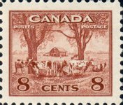
Here's a Canadian stamp featuring Mount Edith Cavell in Jasper.
Cavell was a Canadian nurse who was executed by the Germans for spying in the First World War. The execution was a scandal at the time, and was used to demonize the Germans, but as it turns out she really was involved in espionage of a sort — she assisted Allied soldiers in escaping German-occupied Belgium and was therefore not protected by the Geneva Convention.
Speaking of design, I think the Mount Edith Cavell stamp is a winner!
Bob
1 Member
likes this post.
Login to Like.
re: Excuse me, you call that a 'design'?
We have a prominent (and I think rather good) statue of Edith Cavell in London, shown below - just another woman not featured on British stamps who really should be, especially this year. By the way, Bob, she was born in Norfolk, England, so I'm afraid you cannot claim her!
There were several propaganda labels issued shortly after her murder which would make a good addition to a WW1 collection - if you Google Image 'edith cavell stamps' you'll see what I mean.
Oh, and I'm going for 'murder' rather than execution, which implies the result of a judicial process. The Geneva Convention, insofar as it applied to espionage, was not in force in 1915 - the treaties of 1864 and 1906 referred only to treatment of wounded soldiers on the battlefield and at sea.
Now someone will say, "Excuse me, you call that a statue?"
Login to Like
this post
re: Excuse me, you call that a 'design'?
I have an example (I assume) of the First World War propaganda label that Guthrum mentions. It was printed se-tenant with three other designs, commemorating/propagandizing:
• The torpedoing of the Lusitania (which was a legitimate military target as it was carrying a great deal of war materiel);
• German Kultur, German culture and civilization as idealized by the exponents of German imperialism during the Hohenzollern and Nazi regimes, and
• The “Zeppelin Triumph,†the militarily insignificant but frightening attacks by Zeppelins on London and other British cities.
Look carefully and you'll see what appears to be an offset (setoff) of wording of some sort on each of the labels. Here's a contrast-heightened detail in greyscale:
I asked the eBay dealer who sold the labels to me if he knew what that offset lettering was, and he had no idea. I wonder if the labels represent some stage in the proofing process.
The Wikipedia article about Edith Cavell discusses how the Geneva Convention was unable to protect her. Here's a quote:
"While the First Geneva Convention ordinarily guaranteed protection of medical personnel, that protection was forfeit if used as cover for any belligerent action. This forfeiture is expressed in article 7 of the 1906 version of the Convention, which was the version in force at the time. The German authorities instead justified prosecution merely on the basis of the German law and the interests of the German state.
"The British government could do nothing to help her. Sir Horace Rowland of the Foreign Office said, 'I am afraid that it is likely to go hard with Miss Cavell; I am afraid we are powerless.' Lord Robert Cecil, Under-Secretary for Foreign Affairs, said, 'Any representation by us', he advised, 'will do her more harm than good.' The United States, however, had not yet joined the war and was in a position to apply diplomatic pressure. Hugh S. Gibson, First Secretary of the U.S. legation at Brussels, made clear to the German government that executing Cavell would further harm Germany's already damaged reputation. Later, he wrote:
"'We reminded German civil governor Baron von der Lancken of the burning of Louvain and the sinking of the Lusitania, and told him that this murder would rank with those two affairs and would stir all civilised countries with horror and disgust. Count Harrach broke in at this with the rather irrelevant remark that he would rather see Miss Cavell shot than have harm come to the humblest German soldier, and his only regret was that they had not "three or four old English women to shoot."' "
Bob
Login to Like
this post

re: Excuse me, you call that a 'design'?
Ok, Speaking of stamp design, I'd love to hear members' opinions on what they believe is the singularly most beautiful stamp of ALL TIME.
Iconic we know. Penny black, US #1 and #2, upside down Jenny, etc etc.
But I'm talking about stamps that are just plain BEAUTIFUL.
I collect US only and I've got just a few common world stamps that were given to me but I've got to be honest. ... Canadian stamps are down right beautiful. I love how the early stamps are mini framed pieces of art work. I love the Canadian land and seascapes.
I also love some of the early colonial African stamps that show the amazing wildlife.
So what say ye? Whats the most beautiful stamp ever produced?
Login to Like
this post
re: Excuse me, you call that a 'design'?
The inverted Jenny is beautiful???
To me it's just a constant reminder of human incompetence (or greed?).
If you're asking about beauty and not design, perhaps it's time for another thread?
Chris
1 Member
likes this post.
Login to Like.
re: Excuse me, you call that a 'design'?
Aren't beauty and design inextricably linked? But yeah, I hear ya. Should I start a new thread?
Login to Like
this post
re: Excuse me, you call that a 'design'?
Chris,
To suggest that the inverted Jenny was the product of greed would mean that there was collusion between the printing, the postal clerk and Robles. That's just too far fetched. It was an error.
See black helicopters much?
1 Member
likes this post.
Login to Like.
re: Excuse me, you call that a 'design'?
I also plead for a new thread. The original post was more to do with WHY is a design beautiful ( = 'good'?), rather than WHAT design is beautiful. It will be interesting to see the various definitions of 'beautiful', but a new thread will hopefully illustrate people's opinions, rather than debate them.
1 Member
likes this post.
Login to Like.