Discussion - Member to Member Sales - Research Center
Discussion - Member to Member Sales - Research Center
Here's is an extract from the beginning of that post:
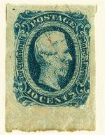
In January 1891 the 10 cent postal rate to the UK was reduced to 7 cents. As there was no 7c definitive, a local firm; Noronha & Sons were instructed to overprint remainders of the 10 cent adhesive to reflect the new rate. Similarly, remainders of the 30 cent mauve were to be overprinted to cover the double weight UK postal rate of 14 cents.
Both overprints are found with the 'antique 't' variety, which occurs once on a pane.
The stamps in question are listed as SG43 and SG43a and SG44 and SG44a (Sc#64? and Sc# 65?).
This post is only concerned with the 7 cent on 10 cent value. Here is an image of a normal on the left and a copy showing the substitution of letter 't' in 'cents' with an 'antique 't' font.


The substitute 't' is distinguished by it being longer and the cross-bar accurately bisecting the vertical downstroke. No explanation has so far been uncovered to explain why this anomaly arose.
Some time ago I finally managed to find a used copy of the variety, in a pair with normal:

The seller sent also sent me as a 'freebie' the following 'antique 't' unused copy:

Although this is not in good condition and has no gum, it is very strange. Here's a close-up:

This has me baffled. I've not actually seen any reference to this oddball before. At first I thought this had either been 'fiddled' with, or was an accidental anomaly, but on closer inspection the "high placed full stop" (period) is a 'mirror' image of the full stop (period) after the 's'; same size, aligned with the top of the text, same spacing, same darker perimeter and same ink:
Furthermore, the reverse is very unusual:

The only conclusion I can come to, is that this is some sort of test print that has been filed as a printer's reference.
I should really submit this to the Kong Kong Study Circle, as I am a member. In the meantime, if anybody has any suggestions, please let me know.
Edit:
For some unknown reason the intended side by side images have decided to display differently, even though I copied the image references from the original post.

1 Member
likes this post.
Login to Like.

Some time ago I posted details about the different overprint types of the 1891 provisionals, in this thread: Hong Kong: errors curiosities and the unidentified. I decided to start a new thread as it is a rather lengthy post.
Here's is an extract from the beginning of that post:
In January 1891 the 10 cent postal rate to the UK was reduced to 7 cents. As there was no 7c definitive, a local firm; Noronha & Sons were instructed to overprint remainders of the 10 cent adhesive to reflect the new rate. Similarly, remainders of the 30 cent mauve were to be overprinted to cover the double weight UK postal rate of 14 cents.
Both overprints are found with the 'antique 't' variety, which occurs once on a pane.
The stamps in question are listed as SG43 and SG43a and SG44 and SG44a (Sc#64? and Sc# 65?).
This post is only concerned with the 7 cent on 10 cent value. Here is an image of a normal on the left and a copy showing the substitution of letter 't' in 'cents' with an 'antique 't' font.
The substitute 't' is distinguished by it being longer and the cross-bar accurately bisecting the vertical downstroke. No explanation has so far been uncovered to explain why this anomaly arose.
Some time ago I finally managed to find a used copy of the variety, in a pair with normal:
The seller sent also sent me as a 'freebie' the following 'antique 't' unused copy:
Although this is not in good condition and has no gum, it is very strange. Here's a close-up:
This has me baffled. I've not actually seen any reference to this oddball before. At first I thought this had either been 'fiddled' with, or was an accidental anomaly, but on closer inspection the "high placed full stop" (period) is a 'mirror' image of the full stop (period) after the 's'; same size, aligned with the top of the text, same spacing, same darker perimeter and same ink:
Furthermore, the reverse is very unusual:
The only conclusion I can come to, is that this is some sort of test print that has been filed as a printer's reference.
I should really submit this to the Kong Kong Study Circle, as I am a member. In the meantime, if anybody has any suggestions, please let me know.
Edit:
For some unknown reason the intended side by side images have decided to display differently, even though I copied the image references from the original post.
1 Member
likes this post.
Login to Like.