Discussion - Member to Member Sales - Research Center
Discussion - Member to Member Sales - Research Center


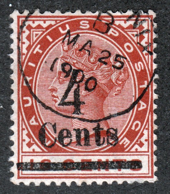
ACSC J5j) "B.C.O.F. JAPAN 1946". 1/-. Perforation 15 x 14. C of A watermark with wrong font (narrow) "N"

2 Members
like this post.
Login to Like.
Hi Rob1956;
The 'N' is also way too short, with respect to the 'A' on the left. It appears to be at least two point sizes shorter.
I would also suspect that the letter 'P' is also wrong. It appears too short with respect to the two 'A's on either side of the 'P'. Maybe it is not the wrong font at all, but the wrong point size. Points are an old method for describing font heights within a font family.
If the 'P' and 'N' were a smaller point size, they would also appear to be narrower. Type setting in this time period was an art form as much as it was technical, and it is not likely that this would happen unless the proper size characters were not available in the proper size.
Another factoid; it would be difficult to insert the leading (strips of lead) that sets the spacing between lines with different point sizes on the same line. If this overprint was type set in Japan, this likely may well have happened because of the Japanese not being familiar with our alphabet. They would also be unlikely to have had the proper type setting materials.
Just stampin'....
TuskenRaider
Login to Like
this post
This article from Gibbons Stamp Monthly (G.S.M.) October 2005 may be of some interest:
http://www.australian-stamp-covers.info/bcof/bcofinfo.pdf
Login to Like
this post
Jillcrow,
Thanks very much for the link. Just finished reading the article -- very interesting indeed. Especially the part describing how stamp collectors were not taken into account upon the release of the overprints.
Eric
Login to Like
this post

Proofs of the B.C.O.F. trial overprints on plain paper. The type set of 4 in my collection illustrates the differing fonts and colours used.


Proof trial in red, and the 1/- with a wrong font '6' (bottom) paired with a normal font '6'. I purposely made the lyrebirds larger to bring the variety into detail.
TuskenRaider I agree that the 'N' is short and there may be a few minor varieties as well, the link posted by Jillcrow explains all that is known about these particular stamps.
Your post is interesting reading.
1 Member
likes this post.
Login to Like.
There is nothing wrong with the N on this stamp. If anyone had bothered to measure the letters they would have seen that it is quite normal in size. Suggest you all get a ruler and measure the bottom of one of the A's from serif tip to serif tip then measure top of N from tip to tip and you will find they are same width. Also compare height of P to height of N and you will find no difference. The N is simply out of alignment and this can be seen by laying rule over tops of AP and under bottom of letters to see how N is shifted upward.
Regards
Frank
Login to Like
this post
Langtounlad, There is a lot wrong with the "N" in question. If you actually compared a normal B.C.O.F. 1/- to the 1/- narrow "N" variety you would clearly notice the difference, it’s the actual font of the ‘N’ that is the error (and of course it's out of alignment, it's the wrong font). I am correct about the stamp. It is a scarce error. It is recorded in the Australian Commonwealth Specialist Catalogue (ACSC), section 7, page 8 under J5j; “N” of “JAPAN” in wrong font.

The above is the correct font, notice the small serifs and the correct size left stem of the "N".

The proof overprint is the same as above

Wrong "N"

Wrong "N" (serifs and size is incorrect, also the stem is thin right to the base, it is also known as a narrow "N" because of the stem)


Correct "N" in uniform with the proof on the right, and the left stem on both is thick down to the base.
The stamp is a genuine J5j; “N” of “JAPAN” in wrong font.
2 Members
like this post.
Login to Like.
Scott catalogue lists this as well, as M5b -- Narrow "N"
Catalogue value of M5b $290.00 USD, while normal M5 is $11.50.
Cheers,
Eric
Login to Like
this post
"Scott catalogue lists this as well, as M5b -- Narrow "N"
Catalogue value of M5b $290.00 USD, while normal M5 is $11.50.
Cheers,
Eric"
Hi Eric
In the ACSC it is valued at AU$475 (the exact amount I paid, and as I always expect well centered to superbly centered mint unhinged stamps, a premium is expected), the normal issue is worth AU$20. It is quite interesting to see the different catalogue values from various books.
The ACSC is accurate with many Aussie stamps, though in some cases it can be quite off the mark.
Login to Like
this post
Member ACCC (Australian Commonwealth Collectors Club of NSW)
16 Dec 2016
09:55:04pm
ACSC J5j) "B.C.O.F. JAPAN 1946". 1/-. Perforation 15 x 14. C of A watermark with wrong font (narrow) "N"
2 Members
like this post.
Login to Like.

re: B.C.O.F. 1/- Lyrebird with narrow "N"
Hi Rob1956;
The 'N' is also way too short, with respect to the 'A' on the left. It appears to be at least two point sizes shorter.
I would also suspect that the letter 'P' is also wrong. It appears too short with respect to the two 'A's on either side of the 'P'. Maybe it is not the wrong font at all, but the wrong point size. Points are an old method for describing font heights within a font family.
If the 'P' and 'N' were a smaller point size, they would also appear to be narrower. Type setting in this time period was an art form as much as it was technical, and it is not likely that this would happen unless the proper size characters were not available in the proper size.
Another factoid; it would be difficult to insert the leading (strips of lead) that sets the spacing between lines with different point sizes on the same line. If this overprint was type set in Japan, this likely may well have happened because of the Japanese not being familiar with our alphabet. They would also be unlikely to have had the proper type setting materials.
Just stampin'....
TuskenRaider
Login to Like
this post
09:22:23am
re: B.C.O.F. 1/- Lyrebird with narrow "N"
This article from Gibbons Stamp Monthly (G.S.M.) October 2005 may be of some interest:
http://www.australian-stamp-covers.info/bcof/bcofinfo.pdf
Login to Like
this post

re: B.C.O.F. 1/- Lyrebird with narrow "N"
Jillcrow,
Thanks very much for the link. Just finished reading the article -- very interesting indeed. Especially the part describing how stamp collectors were not taken into account upon the release of the overprints.
Eric
Login to Like
this post
Member ACCC (Australian Commonwealth Collectors Club of NSW)
18 Dec 2016
11:33:42am
re: B.C.O.F. 1/- Lyrebird with narrow "N"
Proofs of the B.C.O.F. trial overprints on plain paper. The type set of 4 in my collection illustrates the differing fonts and colours used.
Proof trial in red, and the 1/- with a wrong font '6' (bottom) paired with a normal font '6'. I purposely made the lyrebirds larger to bring the variety into detail.
TuskenRaider I agree that the 'N' is short and there may be a few minor varieties as well, the link posted by Jillcrow explains all that is known about these particular stamps.
Your post is interesting reading.
1 Member
likes this post.
Login to Like.
04:14:42pm
re: B.C.O.F. 1/- Lyrebird with narrow "N"
There is nothing wrong with the N on this stamp. If anyone had bothered to measure the letters they would have seen that it is quite normal in size. Suggest you all get a ruler and measure the bottom of one of the A's from serif tip to serif tip then measure top of N from tip to tip and you will find they are same width. Also compare height of P to height of N and you will find no difference. The N is simply out of alignment and this can be seen by laying rule over tops of AP and under bottom of letters to see how N is shifted upward.
Regards
Frank
Login to Like
this post
Member ACCC (Australian Commonwealth Collectors Club of NSW)
20 Dec 2016
07:53:49pm
re: B.C.O.F. 1/- Lyrebird with narrow "N"
Langtounlad, There is a lot wrong with the "N" in question. If you actually compared a normal B.C.O.F. 1/- to the 1/- narrow "N" variety you would clearly notice the difference, it’s the actual font of the ‘N’ that is the error (and of course it's out of alignment, it's the wrong font). I am correct about the stamp. It is a scarce error. It is recorded in the Australian Commonwealth Specialist Catalogue (ACSC), section 7, page 8 under J5j; “N” of “JAPAN” in wrong font.
The above is the correct font, notice the small serifs and the correct size left stem of the "N".
The proof overprint is the same as above
Wrong "N"
Wrong "N" (serifs and size is incorrect, also the stem is thin right to the base, it is also known as a narrow "N" because of the stem)
Correct "N" in uniform with the proof on the right, and the left stem on both is thick down to the base.
The stamp is a genuine J5j; “N” of “JAPAN” in wrong font.
2 Members
like this post.
Login to Like.
re: B.C.O.F. 1/- Lyrebird with narrow "N"
Scott catalogue lists this as well, as M5b -- Narrow "N"
Catalogue value of M5b $290.00 USD, while normal M5 is $11.50.
Cheers,
Eric
Login to Like
this post
Member ACCC (Australian Commonwealth Collectors Club of NSW)
21 Dec 2016
01:50:26am
re: B.C.O.F. 1/- Lyrebird with narrow "N"
"Scott catalogue lists this as well, as M5b -- Narrow "N"
Catalogue value of M5b $290.00 USD, while normal M5 is $11.50.
Cheers,
Eric"
Hi Eric
In the ACSC it is valued at AU$475 (the exact amount I paid, and as I always expect well centered to superbly centered mint unhinged stamps, a premium is expected), the normal issue is worth AU$20. It is quite interesting to see the different catalogue values from various books.
The ACSC is accurate with many Aussie stamps, though in some cases it can be quite off the mark.
Login to Like
this post