Discussion - Member to Member Sales - Research Center
Discussion - Member to Member Sales - Research Center


1 Member
likes this post.
Login to Like.
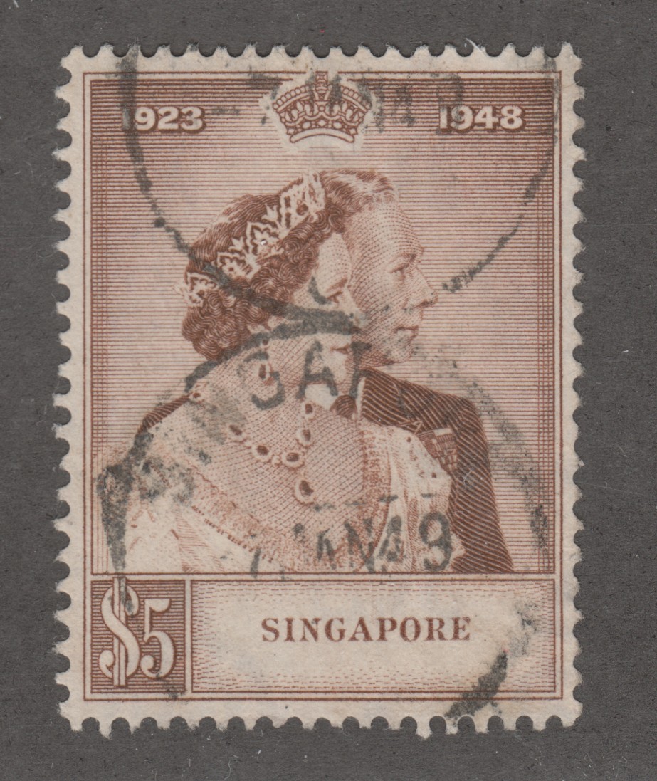
I am surprised that a virtually unreadable cancel counts as "very fine used". IMHO, one should be able to find out when and where a stamp was used. Hence, I should grade the "good used" stamp the highest of the four, but still not as high as it could be because the greater part of the place name is missing.
But maybe that's my German bias because dated town postmarks have been the norm over here for a long time, and even machine cancels usually print the date where the stamp is supposed to be.
Login to Like
this post
The grading shown here is used by an internationally known company that sells premium quality stamps, they have been around for just over 40 years, these grades are what one should use to properly grade their stamps.
If the cancellation had been lightly applied then it would be graded as VFU, or CTO if it was a post office strike solely for a collection.
It would sound a little odd to some people, but it is a very good account to grading Australian stamps.
Login to Like
this post
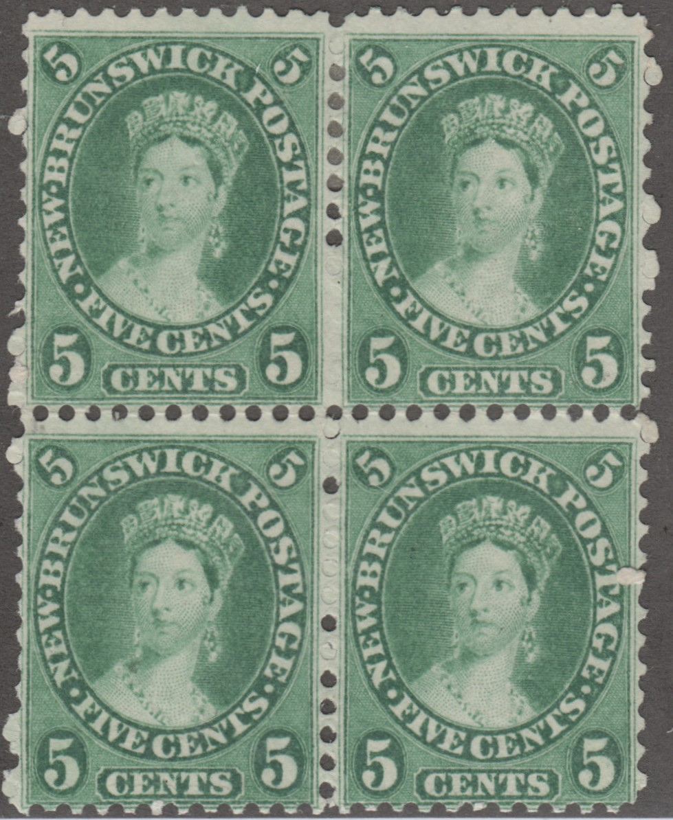
There are two main ways to look at a post mark. Does it interfere with the picture on the stamp or does it give information about when and where the stamp was posted? Some people want interesting postmarks, some want no interference with the picture on the stamp.
3 Members
like this post.
Login to Like.
Hi Rob,
Grading is a slippery slope but personally I lean towards systematic organization and definitions. My first observation is that the centering of the design is but just one part of an overall stamp grade. Typically a grading system includes stamp condition (like pulled perfs, creases, etc.). They also sometimes include gum condition in mint stamps. they also cover things like natural inclusions on a stamp. And what about the centering of a vignette in a two pass printed stamp (or color alignment in modern multiple color stamps)?
In my opinion the current state of grading is a bit of a mess due to the lack of a universal standard. Here in the US grading is done many parties including; 'self-grading', software grading, catalog publishers grading, and a group of better known grading organizations like PSE, PF, APEX. None use the same criteria, some do not even publish their criteria. Consumer/hobbyists are left on their own to figure out what a grade may or may not mean.
I would love to see a ‘grading open source’ standards document, something that all grading entities would agree upon. If something like this were in place, grading would stand a much better chance at being widely accepted as opposed to the current situation of the murky and confusing state of affairs it is now.
Don
2 Members
like this post.
Login to Like.
Hi to all
Rob's system is also used in a similar format by Stanley Gibbons, so the lighter the postmark and the better centred the better the stamp.
However, just to throw a spanner in the works, some Australian state issues have rare postmarks and command a premium, and the easier the full postmark is to read the more the stamp will obtain from collectors who specialize in that area. I have many Australian state stamps with numeral cancels and normal town cancels, but to me the heavier they are the uglier the stamp is.
I am sure if I researched a lot of them with thoroughness I would find a few very rare ones as well, but that type of collecting is to specialized for me at the moment.
Sorry for the divergence, but I like my stamps lightly canceled or MNH, this I have learnt for Rob's excellent showing of his treasures of which I am extremely envious.
Regards
Horamakhet
2 Members
like this post.
Login to Like.
I pray to all the philatelic gods that numerical grading never becomes the world standard!
2 Members
like this post.
Login to Like.
Dave, I second that.
The grading used by the Michel catalog is practically the inverse of the above, when it comes to postmarks. A fully readable postmark (including, but not limited to "bullseye cancels") is the highest grade, a light cancel, e.g. in the corner, the lowest. Probably in order to prove genuine usage within the time of validity.
But different people have different preferences, and that's fine, otherwise the world would be boring.
-jmh
Login to Like
this post
Member ACCC (Australian Commonwealth Collectors Club of NSW)
18 Jan 2021
06:30:31pm
Grading Australian stamps can be a difficult thing to do, the image attached shows how to grade Australian stamps, and this information includes KGVI and early QEII stamps.
1 Member
likes this post.
Login to Like.

re: Grading Australian stamps
I am surprised that a virtually unreadable cancel counts as "very fine used". IMHO, one should be able to find out when and where a stamp was used. Hence, I should grade the "good used" stamp the highest of the four, but still not as high as it could be because the greater part of the place name is missing.
But maybe that's my German bias because dated town postmarks have been the norm over here for a long time, and even machine cancels usually print the date where the stamp is supposed to be.
Login to Like
this post
Member ACCC (Australian Commonwealth Collectors Club of NSW)
19 Jan 2021
12:33:53pm
re: Grading Australian stamps
The grading shown here is used by an internationally known company that sells premium quality stamps, they have been around for just over 40 years, these grades are what one should use to properly grade their stamps.
If the cancellation had been lightly applied then it would be graded as VFU, or CTO if it was a post office strike solely for a collection.
It would sound a little odd to some people, but it is a very good account to grading Australian stamps.
Login to Like
this post
12:39:32pm
re: Grading Australian stamps
There are two main ways to look at a post mark. Does it interfere with the picture on the stamp or does it give information about when and where the stamp was posted? Some people want interesting postmarks, some want no interference with the picture on the stamp.
3 Members
like this post.
Login to Like.

re: Grading Australian stamps
Hi Rob,
Grading is a slippery slope but personally I lean towards systematic organization and definitions. My first observation is that the centering of the design is but just one part of an overall stamp grade. Typically a grading system includes stamp condition (like pulled perfs, creases, etc.). They also sometimes include gum condition in mint stamps. they also cover things like natural inclusions on a stamp. And what about the centering of a vignette in a two pass printed stamp (or color alignment in modern multiple color stamps)?
In my opinion the current state of grading is a bit of a mess due to the lack of a universal standard. Here in the US grading is done many parties including; 'self-grading', software grading, catalog publishers grading, and a group of better known grading organizations like PSE, PF, APEX. None use the same criteria, some do not even publish their criteria. Consumer/hobbyists are left on their own to figure out what a grade may or may not mean.
I would love to see a ‘grading open source’ standards document, something that all grading entities would agree upon. If something like this were in place, grading would stand a much better chance at being widely accepted as opposed to the current situation of the murky and confusing state of affairs it is now.
Don
2 Members
like this post.
Login to Like.

re: Grading Australian stamps
Hi to all
Rob's system is also used in a similar format by Stanley Gibbons, so the lighter the postmark and the better centred the better the stamp.
However, just to throw a spanner in the works, some Australian state issues have rare postmarks and command a premium, and the easier the full postmark is to read the more the stamp will obtain from collectors who specialize in that area. I have many Australian state stamps with numeral cancels and normal town cancels, but to me the heavier they are the uglier the stamp is.
I am sure if I researched a lot of them with thoroughness I would find a few very rare ones as well, but that type of collecting is to specialized for me at the moment.
Sorry for the divergence, but I like my stamps lightly canceled or MNH, this I have learnt for Rob's excellent showing of his treasures of which I am extremely envious.
Regards
Horamakhet
2 Members
like this post.
Login to Like.

re: Grading Australian stamps
I pray to all the philatelic gods that numerical grading never becomes the world standard!
2 Members
like this post.
Login to Like.
re: Grading Australian stamps
Dave, I second that.
The grading used by the Michel catalog is practically the inverse of the above, when it comes to postmarks. A fully readable postmark (including, but not limited to "bullseye cancels") is the highest grade, a light cancel, e.g. in the corner, the lowest. Probably in order to prove genuine usage within the time of validity.
But different people have different preferences, and that's fine, otherwise the world would be boring.
-jmh
Login to Like
this post